MORGAN KANE
Morgan Kane was a Renaissance man, one of those talented individuals who somehow seem to excel at whatever they turn their attention toward. First and foremost, he was a great artist who lived and painted for most of a century. He created hundreds of beautiful paintings, magazine illustrations, movie posters and book covers. At one point in his artistic career he decided to focus on photography. His photos were quickly in demand from leading publishers for magazine covers, advertisements, and paperback covers. Once, he decided to explore hypnotism. Before long he was the president of the New York branch of the National Federation of Hypnotists. That just seemed to be the way he jumped into anything that caught his interest. After his wife had died, Morgan was in his sixties and looked around for something to enjoy during his free time. So he took up figure skating. And he continued to paint well into his nineties.
Morgan Kane figure skating with unidentified partner. Behind him is his son, Jeff Kane
Morgan Kane in his studio. All photos courtesy of Jeff Kane.
Morgan Kane was born in Wilmington, Delaware on July 1, 1916. He won a scholarship to the Cleveland Institute of Art, where he graduated in 1942, having met there the love of his life, artist Kay Haefele. They were married and had a son and a daughter. After Morgan graduated, he served for three and a half years in Washington DC, where he illustrated flying manuals and created posters for the Army Air Force.
When the war ended Morgan went to work in one of the great cities for illustrators of the day, Chicago. He worked with many legendary greats (like Hadden Sundblum) doing ads for companies like Coca-Cola. Examples of his work in Chicago are now scarce, but in 2016 something really spectacular showed up on eBay. A seller was offering art from the files of The Merrill Company, including this fabulous 1951 coloring book cover by Morgan Kane:


|

But he wanted to do much more than ads, and Merrill was one of the few publishers in Chicago. Most of the major magazine and book publishers were in New York City. In 1951 Morgan and Kay and their children moved to Connecticut, and he went to work in Manhattan. His first credit on a paperback cover was a 1952 Pocket Book. With talent to spare evident from the first, Morgan Kane quickly became one of the top illustrators of magazine covers and story illustrations. His first illustration was for a Catholic magazine called Extension. His work is also found in Saturday Evening Post, The American Magazine, McCall’s, Ladies Home Journal, Liberty, Cosmopolitan, Esquire and others. Over the following forty-five years he would create hundreds of paperback covers for most of the leading publishers of the day. He could be relied on for a perfectly professional job every time out. And after a while, it looked like he could paint anything an author could dream up.
With around 500 book covers this is one of the largest catalogs I’ve ever attempted, so I simply don’t have the room or time to track down and showcase every one of his often-brilliant magazine covers or illustrations, but they are often available on eBay. Here is a sample:
|

“The Lady Called Brazil”, Saturday Evening Post, February 9, 1957.
|
“Road to Somewhere”, Saturday Evening Post, August 9, 1958.
Morgan Kane continued to create memorable magazine art throughout the 1950s. Perhaps the leading expert on 20th century illustration was Walt Reed, who edited three different editions of THE ILLUSTRATOR IN AMERICA (1964, 1984, and 2001). Walt Reed made sure Morgan Kane was included in all three editions:
“Morgan Kane adopted a very effective practice which contributed much to his growth as an illustrator. Between assignments, he spent his time trying out new approaches for hypothetical stories. Art directors were so impressed by these samples that, in several instances, they bought the picture to hold for an appropriate story. In one case, a story was specifically written to fit the picture.”
Although rather atypical for the Rockwell-esque American Magazine, this piece from the collection of Brian Emrich shows off Morgan Kane’s versatility:
|

“This is Love”, American Magazine, June 1958, original art, courtesy of Brian Emrich.
For the February 1965 issue of Extension magazine, Morgan Kane was asked to paint a cover portrait of the president, Lyndon Baines Johnson. His benevolent, smiling and prayerful Johnson was just what their readers needed. Now it seems a reminder of days gone by.
Morgan Kane’s cover for EXTENSION Magazine, February 1965:
He also did a few paperback covers and was painting more and more of them into the 1960s. But then, starting in 1966, his name only appeared on photo covers for the next decade. Why did he switch from painted covers to photo covers? I suspect there were a couple reasons. He was a master of versatility, could paint in many different styles for different genres. But paperback publishers had a bad habit of pigeonholing cover artists. If you painted a Western they liked, you would get stuck with Western assignments only. If you look at Morgan Kane’s cover art in the period before he stopped painting, a lot of them are nurse books and doctor books. And a lot of them look the same because that is exactly what the art department wanted. Nurse books and doctor books are just fine, but what Morgan Kane desired was variety. He did not want to paint the same thing over and over. He once said he couldn’t understand fellow artists who made every single painting look just the same. He said it was like going out to eat at a fine restaurant every night but then just ordering the exact same thing every single time. After a while, it must get boring. And there are lots of different meals out there to be sampled. So he bided his time and did something else until the climate for painted paperback art changed. The other reason I think he started his photo studio was he had - like many other illustrators - been using photos he had taken of modeling sessions as templates to create his paintings from. At some point he might have noticed that many of those photos were as good as or better than the photo covers that were becoming more and more popular with his publishers. He could eliminate the long laborious step of painting and still get paid for his work. Morgan Kane then created hundreds of photo covers, many of them quite stunning, many of them fascinating and beautiful. And some others… well, not so much. In the course of researching this project I learned that Morgan was the first photographer responsible for the much-maligned Mike Shayne Dell photo covers of the early 70s. My theory is that the man responsible for all this this maligning was actually Robert McGinnis, because before the switch to the photo covers, Robert McGinnis had been painting Mike Shayne covers for over a decade. And they were absolutely beautiful and memorable and are still celebrated and collected today. Suddenly, in 1971, all that drastically changed. Instead of those lovely McGinnis beauties, Dell changed to photo covers featuring a male model who was supposed to be Mike Shayne. But he didn’t look anything like the Mike Shayne the readers all knew from the books. To make matters worse, he was attired in ‘hip” fashions of the day like plaid pants. The covers looked dated almost as soon as they came out. Why would Dell suddenly make such a sweeping change? For one reason, many publishers at that time were switching their bestselling series books to cheaper photo covers. For whatever reason, and I’ve heard a few, Dell continued using photo covers on the Mike Shaynes with other photographers after Morgan Kane moved on.
Kane returned to painted covers at the end of 1974. He would occasionally do photo covers through 1987, but most of the rest of his work was painted, in a variety of styles. Overall, most people are surprised to learn it is all the work of one artist. He could paint in any genre assigned and excelled at all of them. On this list you will see mysteries, fiction, non-fiction, science fiction, romance, historical romance, Gothic romance, young adult, poetry, classics, horror, spy thrillers, movie and TV tie-ins, biographies, self-help books, everything. His covers throughout the late seventies and eighties are dynamic and often unforgettable.
Kane was doing memorable and varied covers for mainstream publishing houses like Fawcett Crest. Crest was pushing the boundaries with unusual cover gimmicks like lenticulars or cut-outs. For TWO MUCH, 1976, they chose to add a fuzzy pink overlay design for the title and the bikinis. Many a collector speculated what might be under that fuzz.
Here from 1976, before the pink fuzz bikinis were added, is TWO MUCH:

|

Morgan Kane’s proof shot for TWO MUCH, image courtesy of Jeff Kane.
Morgan Kane’s 1977 painting for Gold Medal 13723, THE MARAUDERS. Image courtesy of Jeff Kane.
|
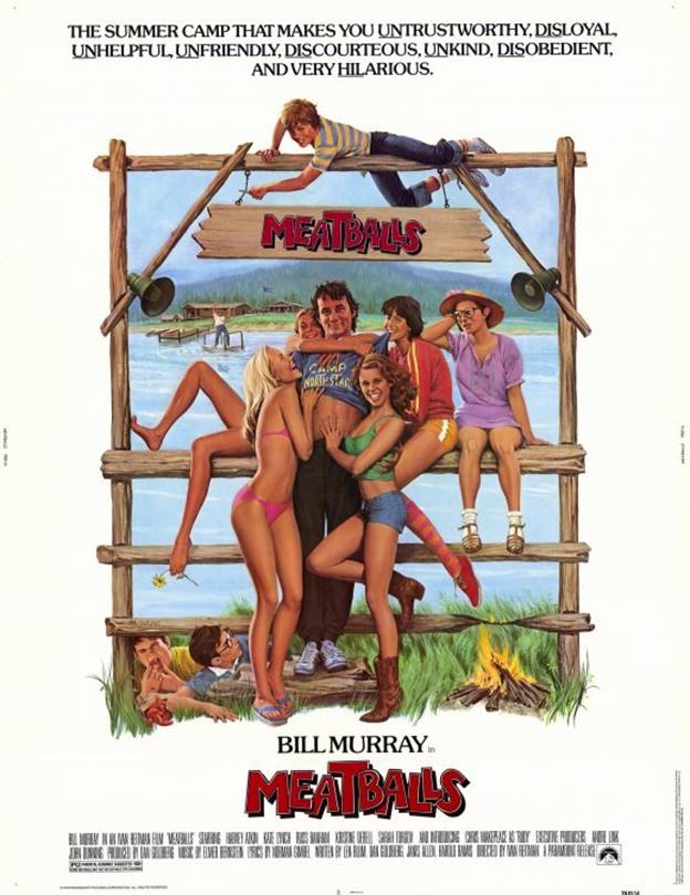
As both a painter and photographer, Morgan Kane began turning out some now-classic movie posters in both styles. Here is Bill Murray in MEATBALLS.
|
|
|
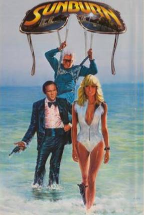
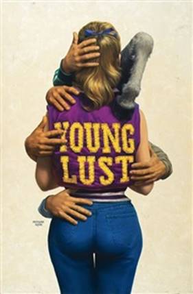
On the left, his poster for SUNBURN. On the right, Morgan’s poster for YOUNG LUST (directed by Gary Weis) showed off his ribald sense of humor.
I have seen the poster for NORTH DALLAS FORTY attributed to both Robert McGinnis and Morgan Kane. I spoke to Art Scott, author of THE ART OF ROBERT McGINNIS, who remembered hearing the whole story. McGinnis created the roughs and sketched out the idea. As often happened due to scheduling conflicts, deadlines or other factors, the art director then chose to go to a second artist, in this case Morgan Kane, to complete the project and paint the finished poster. So both of these great artists had a hand in this design. And it explains why this Kane poster reminds some people of a McGinnis.
|

Morgan Kane’s most talked-about and controversial poster was for the 1981 James Bond movie FOR YOUR EYES ONLY. The leggy model seemed to be showing more skin than the norm for that time. (I’m not sure she would even raise an eyebrow today.) The poster was rejected or censored by many newspapers and banned in Britain. Morgan Kane achieved the effect by having his model put her bathing suit on backwards.
On July 20, 1981, People Magazine ran a story about the poster, noting that three different models had come forward to claim they were the faceless woman showcased on the iconic poster. Photographer Morgan Kane was quoted explaining how all three could have made that claim. One model was used for the proposal. When the idea was accepted, Kane then did a photo shoot in London with Roger Moore and the second model. Her arm was used on the poster and she recognized the rings on her hand. But somebody decided her legs weren’t just right, so Kane re-shot it back at home in New York with the third model, Joyce Bartle. It was a story that only Morgan Kane could have explained.
|

This photo was later copied by a different artist for the painted international movie poster.
In the 1970s, both Morgan and his artist wife Kay were painting covers for publishers such as Bantam and Dell. Morgan continued to create vibrant art for book covers each year, although in the early 80s he took over a year off to spend time with and care for his wife, who died of cancer in 1982.
On the website he would establish years later, Morgan showed a photo of himself posing for a cover shoot. The book was LONGARM #1:
|
|


Kane was so good publishers started using him to create logos and templates to be followed by other artists. One example of this is the LONGARM series from Jove. Morgan Kane set the standard by creating the image of Longarm and painting the first dozen covers in the series. Other artists then took over and there were more than 400 books published in that series. And there were other series from other publishers who copied the “Longarm look”.
In a similar manner, Pocket Books enlisted him to set the standard for their new series of Hardy Boys and Nancy Drew books, now in paperback. He painted the first two Hardy Boys Casefiles books, and the first in their Nancy Drew / Hardy Boys Super Mystery series, a saturated-color cover that looks like they asked Maxfield Parrish to try a Nancy Drew book. Many other artists then followed in his footsteps.
He continued painting cover illustrations into the 1990s, and he lived long enough to see major changes in the world of paperbacks. First the market shifted and the great illustrators could now only find work doing romance covers. I’m not saying there is anything wrong about painting romance covers, there are many fine examples, just that it became the only kind of book still using painted covers. We began to see romance covers from versatile pros like Robert McGinnis and Robert Maguire. There were several really fine romance artists in that era, and Morgan Kane was one of the best of them.
With his usual sense of style, Morgan Kane sailed into the romance assignments full steam ahead. He created colorful covers that became great favorites of romance fans and can still be seen on internet romance sites to this day. He mastered the art of the stepback, the two-page “inside cover” art that many romance publishers began using.
Morgan had painted “inside cover” art as early as 1976, but the real boom in romance stepbacks started around 1989. Morgan painted at least 22 of them through 1995. (Although no longer used as much, they are still selling them. I saw one recently at my local drug store bookrack.)
Mass-market paperbacks had always used flashy sexy cover art to sell the book. Sometimes the art was racier than anything inside. Most adult readers seemed unconcerned about racy cover content, but as romance covers got increasingly steamier, somebody realized that their fans were not as comfortable being seen in public with a book showing a naked hunk coupled with a somewhat-clothed young woman. Some of the other romance artists were well known for depicting men and women locked together in poses that could only make sense if they were in mid-fornication right there on the book cover. There was always a bedsheet or a ripped bodice covering the naughty bits, but anybody could see what had to be going on. Soon there was not that much of a gap between some of the naughtier adult paperback covers and some “mainstream” romance stepback art.
So the steamier images were discreetly covered up. The top or “front” cover was always completely innocuous, a flower or a garter or a jewel with the book’s title and author. But right under that front, the real story awaited. As any reader of the romance books of that era can tell you, they were not just as racy as “vintage sleaze” erotica, they were more so.
In the 90s, chiseled musclemen with shoulder-length hair flexed their way across romance covers. There was one rule: the man had to be shirtless. There is a “not used” painting on Kane’s website that appears to be a first draft for a marvelous romance stepback called TAPESTRY. When the book came out, the image was similar, but now the man’s shirt was gone. Kane’s 1995-96 covers for the Western series McMASTERS for Jove look more like romance covers than cowboy stories. The hero appears on five of the six books without his shirt. There are a couple reasons why this happened –this was the era of the “adult Western”, and the artist had been painting romance covers for a decade with the same models. But surely the main factor had to be that this was exactly what the art department dictated. They knew what they needed to sell their product. I’m not sure Roy Rogers or Gene Autry would recognize from the menage a trois on the cover that McMASTERS #5 is a Western.
Then the great tradition of artist-supplied covers began to die out altogether. Publishers started putting out books with just the title and author’s name on the front, no art. I guess those books sold well because they kept doing them. Certainly they were cheaper to make. Then they started using computer-designed covers. It was a different kind of art with new players. One of the old-school cover artists told me “A paperback cover used to be the work of one artist. One man or one woman. Two people if you want to count the input from the art director. Paperback covers are now made by a committee.”
Even the painted romance covers trickled out. The market slipped away gradually, with only a handful surviving into the new century. Morgan Kane’s final paperbacks were painted in 1997 for a romance publisher called Silhouette. He was 81 then.
Silhouette was a division of Harlequin, and like a lot of Harlequins their covers by other artists often seem a bit tame today. Categorically unable to paint a bad cover, Morgan continued to create beautiful new images. After the paperback cover assignments dried up, he continued painting into the 21st century. Many of his wonderful later paintings can be viewed today online at various art websites, galleries and auction houses. Here is one from 2006, painted an amazing 55 years after the Firefighters Coloring Book shown above.
In the new world of the internet, Morgan set up a website to sell his paintings and showcase his art. He also created a mailer to send out. In addition to four movie stars from his movie art work (Goldie Hawn and three from RYAN’S DAUGHTER: Sarah Miles, Robert Mitchum and Trevor Howard), he selected about 50 of his paperback covers, providing a good overview of his versatility and offering some insight into which of his covers might have been among his favorites

|

He had a long, rich, varied career, and by all accounts he loved almost every moment of it. Morgan Kane died on June 25, 2014, a week before his 98th birthday.
TO BURN AGAIN BRIGHTLY, Dell 1985. Oil on canvas.
A Note about the Checklist
With a list of around 500 books, some semblance of order has to be struck to avoid total chaos. A lot of lists are presented alphabetically, but I wanted to show the arc of his career, how it started and where it finished. So I have chosen to list the books chronologically by year of publication. Since we are not sure exactly what order he created each cover within a given year, the books are then listed alphabetically by publisher. And, whenever possible, then in the order each of those houses published them. As a result, a Signet book published in early January 1967 will appear here after an Avon book published at the end of December 1967.This way of presenting the books for you usually works. It just gets a little confusing when the publishers do not release their books in numerical order. Books may have been planned but then held up for one reason or another. So be warned, the numbering here is not always strictly sequential. For example, Bantam N3555 is dated 1968. It is numerically followed by N3556, F3558 and F3559, but those are all dated a year earlier, 1967. All four of those books have Morgan Kane covers, so on this chronological list N3555 is shown a year after those other three, and not before them.
I have tried when possible to alleviate this confusion by noting something like “N3555 – see 1968’ on the checklist before N3556.
Original art for THE WORLD’S LOVE POETRY, Bantam 1968. Mixed media.
From Morgan Kane’s website: “Book cover not used, oil on canvas”. Long hair, flowers, passion and texture you can almost feel.


Lynn Munroe Books