GEORGE ZIEL
By Lynn Munroe
Each one of us is born with a
destiny. The time and place where we happen
to be born can have a profound influence on how our destiny plays out. It was
Jerzy Zielezinski’s destiny to be born in Poland on March 28, 1914, a
combination of place and time that made him a young man of 25 when the Nazis
invaded his homeland in 1939. The Nazis sent Jerzy to a place they called the
Warsaw Ghetto, where they crammed one million people, anybody they didn’t like
– Jews and Catholics and homosexuals and gypsies and others from the poor to
the nobles – in what we now know was the beginning of a spirit-shattering, nightmarish
chapter of history called the Holocaust. As World War II raged on in Europe,
the Nazis loaded people from the Warsaw Ghetto onto trains and shipped them to
concentration camps. Jerzy Zielezinski was sent to a place called Dachau. The Holocaust was an attempted genocide, so
difficult to come to grips with that some small-minded people later refused to
believe it really happened. But all the rest of us know. We know in our hearts it
actually happened and we know when and where. We know from the first-hand reports
of the horror-struck liberators, the films and documents that were made of the
camps, and the gut-wrenching and horrifying eyewitness testimony of the
Holocaust survivors.
Adolf Hitler’s mad attempt to
destroy the world failed, but millions died at the hands of the monsters who
took control of Germany before the camps were liberated in 1945. Jerzy was a Holocaust survivor. These
remarkable heroes are dying out now, seven decades later, dying of old age, but
their stories must not be allowed to die with them. Places like Holocaust
Museums are vitally important memorials of our history, the history of man’s
inhumanity to his fellow man. And some of those Holocaust memorials today have
art created by Jerzy Zielezinski in the 1940s.
Jerzy was an artist; he felt a
powerful need to create art that the restrictions at Dachau could not destroy.
Paper and pencils were forbidden, so Jerzy used to sketch on pieces of scrap paper
using bits of charcoal. He made sketches of his fellow prisoners and of life in
the camps. When Dachau was liberated,
Jerzy was taken to a hospital. During his convalescence there, he turned his rough
sketches into drawings and created new images from the memories burned into his
mind. These drawings were collected
into two books. The first, titled K.Z. ALBUM (PRISONER ALBUM) was published in
Munich in 1946. This album collected his images of life in the Ghetto.
By the time the second collection was published, this one dealing
with life in the camps, Jerzy had westernized his first name to George. 24 DRAWINGS FROM THE CONCENTRATION CAMPS IN
GERMANY by George Zielezinski was published by Bruckmann in Munich in 1946.
The first collection has become a
scarce collector’s item; a copy was recently auctioned in Jerusalem. The second
collection has been seen at several Holocaust Museums, and can be viewed online
at the University of Minnesota’s Center for Holocaust and Genocide Studies. The images are unforgettable, first-hand
testimonials to despair and suffering that make our very souls ache. Mercifully, George Zielezinski survived, bringing
copies of his work to America when he moved to New York a few years later.
Our first record of George in
America is found in the Friends
Intelligencer, the news journal of the Society of Friends in Philadelphia.
The Quakers are pacifists who of course opposed the War and have always seen
the importance of preserving and passing on stories of the Holocaust to anyone
willing to listen. This is from the November 24, 1951 issue of the Friends Intelligencer:
|
K.Z. ALBUM (PRISONER
ALBUM), MUNICH 1946
Illustrations of life in
the ghetto- click to enlarge: (Image from Kedem Public
Auction House Ltd, Jerusalem, Israel |
“Two pictures hang on either side
of the window at the stair landing of (the Friends’ Meeting House) whose
address is 20 South 12th Street, Philadelphia. As both Friends and non-Friends
have hurried up or down that stairway on A.F.S.C. (American Friends Service
Committee) business, some have paused and wondered at the strangeness of
finding such pictures decorating a Friends meeting house. Here is the
quintessence of horror suffused with compassion. The stark realism of these
pictures suggests less the skeletal residue of human suffering than the rhythms
of elemental forces. These two pictures are part of a series of 24 prints on life
and death and the infinite gradations between as they were observed in a
concentration camp. They were completed while the artist, George Zielezinski,
was in a hospital recovering from the effects of the last war. Now known as
George Ziel, this refugee from Poland is working in a New York City restaurant,
hoping to find employment eventually in commercial art. Those interested in securing a folio ($10 a set, signed by the
artist) should get in touch with Elsie Hines at 20 South 12th Street,
Philadelphia 7, Pa. The size of each plate is 7 ¾ by 10 ½ inches, with generous
borders beyond. The German introduction to the folio was written by Ernst
Wiechert, German author and poet, recently deceased. A copy of the English
translation of this introduction by Johannes Ruck has been included with the
set. An excerpt from the introduction notes: “Here we find no beauty except
that of light and dark. But there is more than beauty. Here is the wide-open
gate of all mysteries and the loosened bolt of all revelation… the earth is
naked, space, time, creation.”
George Ziel’s wishes to become a
successful commercial artist came true, and we begin to see his work on books
dated 1954 and 1955. (A checklist of his cover art follows.) George Ziel was a
very private person; he flew low on the radar and did not have many friends
from the worlds of art or book publishing. His wife died a few weeks before he
did and they had no children. His only relatives live in Poland. As a result of
all this, information about Ziel began to fade in the years following his death
in 1982. Only a handful of his 300+
books have his name on them. When I came into the paperback collecting hobby in
the 1980s, I never heard his name. The story of how I learned his name was told
on my previous checklist on Charles Copeland: a prominent paperback dealer
confused Copeland and the uncredited Ziel’s styles and attributed Ziel covers like
the Chester Himes Avons to Copeland. I decided there were two artists involved,
but what was the name of that uncredited artist? My friend Art Scott had the
answer. He owned a 1958 Pyramid called YALLER GAL that was obviously the work
of the “uncredited artist”. On the back cover it said: “Cover painting by
George Zeal.” We quickly learned Pyramid had spelled his last name wrong, and
we started to notice other paperback covers in the same unique style. The search
led me to people outside the book collecting hobby who had always known who
George Ziel was, like Illustration House in New York City, and the Society of
Illustrators, where George had been a member and had donated some of his
paintings to their collection.
|
24 DRAWINGS FROM THE CONCENTRATION CAMPS
IN GERMANY
George Zielezinski
Bruckmann, Munich, 1946
http://chgs.umn.edu/museum/responses/zielenski/ |
Ziel came bursting out of the
gate in the mid-1950s with a series of earthy, sensual covers that demanded our
attention. Many of them featured a cover model who had an African American look
about her. Her face helped us early on
as we searched through uncredited covers to create this first Ziel checklist. Those
great Avons by Chester Himes, vintage Aces by Wilene Shaw, a Rex Stout mystery
from Hillman Books; all of them reminded us of that credited cover art on the
Pyramid YALLER GAL.
|
 Original art for
BITTER LOVE (Pyramid G278, 1957), courtesy of Bruce Black Original art for
BITTER LOVE (Pyramid G278, 1957), courtesy of Bruce Black. |

Original art for
SCOWTOWN WOMAN
(Ace D-428, 1960) - click to enlarge
Image courtesy of
paperbackart.com
|

In September 2011, George Ziel’s painting for STEP IN THE
DARK (Paperback Library 52-988, 1966) was auctioned as “gothic romance cover by
an unknown artist”. Click to enlarge
|
At Pyramid, George met art director
Rolf Erikson. Erikson loved Ziel’s work, so when he became art director at other
publishers in the 1960s and 1970s like Paperback Library and Popular Library,
he always made it a point to include George Ziel in his pool of artists. Most
of the art directors who employed Ziel have died, but Rolf Erikson is still
with us, a retired widower living in upstate New York. I first noticed Rolf Erikson’s name as the
designer of a fabulous Ziel paperback called ALTA IN THE SHADOWS from Freeway
Press. Then I found an old issue of Publisher’s Weekly that told a story about how
art director Erikson and his cover artist Ziel pumped life into Simenon’s
Inspector Maigret books for Curtis (a division of Popular Library) and won an
Edgar Award. When I interviewed Rolf Erikson, he told me about befriending Ziel
at Pyramid:
“Our wives became friends too, so
we’d go out for dinner or a drink. George was a cognac man, he drank brandy. He
drank vodka too, but he loved cognac.
His wife Elsie was a nurse at one of the hospitals in Manhattan. He never really
spoke English all that well. He’d call me up and say something like, “Am
speaking George Ziel”. So his wife
would read the books for him and tell him something about the story and then he
would paint a cover from that. He was a
marvelous painter. Some of his paintings are oil on board, some are gouache on
board. He could go back and forth, giving different covers a different
feel.
“He had his own special color black that he used… oh, what
was it called, it’s been so many years I’ve forgotten… but it gave the black
hair he painted a blue-black sheen that was unique. I remember thinking then
that if the artists who worked for me were called commercial artists, then
George Ziel was a fine artist who chose to do commercial work. He didn’t have many artist friends. I’d go
to visit him and the friend he would have there would be a Norwegian sea
captain or something. George claimed his father had been a Polish nobleman, a
Count or something, so that made George a Count too! The Nazis came to town when
George was 25 and told his father to do some job for them. When his father told
them to go to hell, they killed him. Then they turned to George and asked him
if he wanted to do the job, or die like his father. They sent him to the Ghetto.
I once asked George what his religion was and he told me that living through
the Holocaust had a way of making you lose your religion.
“He had this portfolio of 24 drawings of the concentration camp
he had done. LIFE Magazine got a hold
of a copy of it and asked George if they could reprint it. And he said ‘Oh no,
those drawings are so primitive, I’m a much much better artist now. Let me
repaint them all for you.’ They didn’t want to pay for new paintings, they
wanted to show the drawings they already had. It was ironic, George was
probably the only person in the world unable to realize the tremendous
importance and raw power of those original drawings. And he said no, he
wouldn’t agree to let them reprint them, so they never appeared in LIFE.”
When Erikson moved on to
Paperback Library, he enlisted Ziel and Victor Kalin and a couple other artists
to create a remarkable series of Gothic Romance covers. “Gothics were blue” is
how he remembers it now, “and George was very good at creating that effect. We
started doing one a month, then they caught on and we were doing four a month.
George was meticulous; he never worked as quickly as the other artists. If
everybody else was doing four or more each month, I’d get maybe three a month
from George.” Ziel’s Gothics are
haunting night visions of windswept, long-haired beauties fleeing mansions with
a light burning in one window. The ever-present moon illuminates the night sky,
usually obscured by the mansion or by moonlit cloudscapes. When I began piecing
together this first Ziel checklist, I decided that more than 40 of these
Paperback Library Gothics were uncredited Ziels. There’s only one Ziel
Paperback Library in the price guides, and that’s because there’s only one Paperback
Library with Ziel’s signature visible on the cover (THE YELLOW MASK). One of my
favorite uncredited Paperback Library Gothics is a dark and brooding work from
1968 called SHORECLIFF:

Imagine my disappointment to find one of those paperback romance
sites on the Internet, where SHORECLIFF and many other covers I’d attributed to
Ziel were credited to Victor Kalin. I thought I recognized Kalin’s style when I
saw it (it helps that many of Kalin’s covers are signed), but after reading that
website, I had doubts. I contacted
Victor Kalin’s daughter Rebecca. She had a long list of her father’s covers,
but not one of the books on my list was on hers. We concluded that the person
on the Internet didn’t know what they were talking about. Later, when I spoke
to the Society of Illustrators in New York, Richard Berenson shared this painting
that Ziel had donated to the Society’s permanent collection:

The artist’s signature was
cropped off the published book. The painting for SHORECLIFF was confirmation
that George Ziel was the uncredited artist of those Gothics, as well as similar
covers for other publishers. Ziel covers continued to appear throughout the
1960s and 1970s. He lived and worked in Manhattan. Ziel painted in several
different genres from romance to mystery to science fiction, but his specialty
gradually came to be realized: he was a master of the macabre. He could do
spooky like few others, often invoking a queasy, unsettled feeling in his
audience with techniques like disembodied faces and hands, or a rat being
chopped in half by a cleaver, or a menacing dark man in a black coat and top
hat waiting outside the door. He stayed
true to his roots and some of his eeriest covers look like the bizarre movie
posters Polish artists were creating at the same time. There is also an
old-time feel to many of his paintings, such as this European-style glimpse of
men in dark hooded cloaks surrounding young women.
|
Ziel appeared to have tapped into
our darkest fears and nightmares, and presented them on vivid paperback covers.
Some of them were romances, some were mysteries, all of them were haunting. The
average reader, with no knowledge of Ziel’s past, could only wonder. To those
who knew his story, the signposts were all clearly marked. Like all great
artists, George Ziel drew on his own experiences and memories, his own visions
and nightmares, to infuse the horrifying world of his best cover art. Although
he rarely signed his name or received a printed artist credit, he nonetheless
became a true modern master of horror, as the checklist of his covers that
follows will make clear.
|

TEMPLE OF DARKNESS
(Ballantine 24857, 1976), detail, click to enlarge. |
For example, is this woman from NIGHTGLEAMS (Ballantine 25310,
1976) just terrified, or has she gone insane? Or perhaps both at once?
George Ziel quietly created some
of the most striking paperback covers of the vintage era. He went on to do several classic mystery
series. He was, after Victor Kalin and Hector Garrido, the third artist
employed by Dell for their 1960s and 1970s Mary Roberts Rinehart books. He did Georges Simenon covers for Curtis and
Popular Library, and a powerful uniform set of 31 Ngaio Marsh mysteries for
Jove that are among his last paintings - and his finest.
|
|
As we looked at more Ziel cover art, certain things began to come up again and again, like a gnarled and leafless black tree, or a tall man wearing a top hat and a long black overcoat. Several Ziel covers capture our attention with a partial face, or an obscured moon in sky full of clouds that change color according to where the moonlight strikes them. At least seven different cover paintings feature a solemn group of faceless men – usually police or gangsters – in fedoras and topcoats standing around a corpse or a car. A stylized black cat shows up a couple times, as does a sinister hooded figure with a pointed cap.
Because publishers Paperback Library and Dell issued new editions of their bestsellers when the prices went up, there are several examples of the same book being covered by both Victor Kalin and George Ziel. |
 |
Two different artists’ approach to the same subject: George
Ziel’s (left) & Victor Kalin’s covers for two Paperback Library editions of
BLACK CANDLE (53-756 and 64-758).
Science fiction: this is an alternate, unused painting that George Ziel did for ALIEN SEA (Ace H-40) in 1968. From the collection of Robert Wiener:

Looking at records on the Internet for auction sales of art by George Ziel, we find the art for a 1981 Avon called THE WAY OF PASSION. The painting was sold by Illustration House in 2009. This is a remarkable Ziel cover for several reasons. First, there’s that date. This proves that Ziel continued to paint, and sell his paintings, until the end of his life. Then, there’s the genre. This is a romance novel, not a Gothic or a murder mystery but obviously in the “modern romance” genre championed by Elaine Duillo and others in the late 1970s and early 1980s, after the Gothic craze of the 1960s and early 1970s had died out. And that taboo subject matter: the lovers appear to be a nun and a priest. The lovers on THE WAY OF PASSION cover have their eyes closed, their heads are together and they are touching each other. I started to notice other uncredited Avon covers like THE ENCHANTED LAND from the same period with those same themes each time. Although painted in a different style than most of his earlier paintings, I believe these later covers on our checklist are all the work of George Ziel. They suggest his willingness to adapt to the changes in book publishing. The editors and art directors did not want books that looked like 1950s or 1960s paperbacks. They no longer wanted Gothics. A new type of romance cover had been born, and George Ziel showed his range when he painted several of these covers for Avon, Ballantine and Jove between 1978 and 1982. After seeing how he always depicted lovers on his later covers – eyes closed, heads together, touching - I went back and noticed the same themes running through early work like A KISS BEFORE DYING (Signet 1147) and TAME THE WILD FLESH (Ace D-464).
|
 Original art for THE WAY OF PASSION (Avon 78287, 1981) Original art for THE WAY OF PASSION (Avon 78287, 1981)
|
 Ziel’s cover art is used in a 1978 magazine ad for the
Avon paperback THE ENCHANTED LAND |

|
Vincent Di Fate, the illustrator, is also a professor at New York’s Fashion Institute of Technology, where he teaches courses in the history of illustration. I asked him about the art of George Ziel:
“I encountered George Ziel's work in the 1960s, when I was newly graduated from art school and carefully looking at paperback art. I became aware of his work in 1967/68. What attracted me was the realization there were only a few highly competent, realistic illustrators working in the paperback field at that time - James Bama, Mitchell Hooks, just a handful of others - and Ziel's work really stood out for a couple reasons. One was that his palette was somewhat muted, not dull, but he didn't use vibrant colors - which is a characteristic of artists from Eastern Europe. And there was the strong emotional quality to his work, especially with his women, with their pale complexions and ethereal glow. Artists who do portraits have a tendency to blot their paintings throughout the process, softening the face and creating a glow, and we don't see a lot of that in the paperback market. In a 4x7 image the faces appear small in reproduction, and sometimes subtlety is lost in reduction, whereas in Ziel's work that aura was always fairly evident. His placement of figures, painting people in middle-distance, may have contributed to that look. With the positioning of objects farther back into the picture plane, as is typical with most paperback art, the details of the faces would have all become quite invisible in the shrinking of size and compression of values. It was so striking in Ziel's case because no one else was doing it at that time in paperback art."
“Learning from his art directors that he had been in a concentration camp explained for me the somber and moving emotion inherent in his work, a quality usually not often found in paperback illustration. Artists tied to the narrative, as most paperback artists are, don't have the need, or even the facility to include it, but that unique emotional pull truly sets Ziel apart.”
|
The “unique emotional pull” of George Ziel’s paperback covers truly makes them stand out. The checklist of his covers presented here allows us to see his work evolve from the elemental, at times purposefully unfinished paintings of the 1950s (for examples see TAME THE WILD FLESH and BITTER LOVE), through the brooding heroines of his 1960s Gothics, and the brilliant boldness of his 1970s horror and mystery titles. The lush romance covers of the early 1980s at first appear to be some kind of new style, but when viewed in context of his complete catalog are more of a culmination of the themes that filter all through each of the stops along the way. And then, with one final creative burst of energy, he ends on a high note with the Ngaio Marsh series for Jove, a big and unforgettable collection of paperbacks featuring terrifying corpses and macabre visions.
Elsie retired and they moved to Connecticut, where she died in 1981. George Ziel died there a few months later on February 28, 1982. He was one month shy of his 68th birthday.
“You know, I had a drink with George the night before he died”, Rolf Erikson told me. “I really think he just gave up after Elsie died. He was tired and he made the decision he had lived long enough. The next day I got the word that he had passed.”
The Society of Illustrators printed a memorial farewell to Ziel in the New York Times. On the morning of March 13th, a Mass for the Repose of the Soul was held at Holy Family Church in New York City. It was arranged by his sister Helena, who is now also deceased. George the Holocaust survivor had survived indeed, living a full and successful life as an artist in America. And now, in a new century, his paintings live on, touching us, inspiring some, frightening others, enchanting us with their beautiful haunting power - the feeling that there is something out there in the dark, waiting for each one of us.
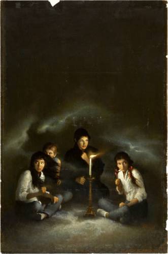
Art for THE SÉANCE (Dell 97937, 1981)

Dead bodies on paperback covers (especially murder mysteries) are very common, and usually not very disturbing. They are often even mildly, although morbidly, titillating. Like dead bodies in old movies, portrayed not by actual corpses but by dummies or living actors trying to stay very still, they are visual shorthand to establish that someone has died. But they bear little resemblance to actual dead bodies. Any first-year mortuary science student or homicide cop can tell you: actual dead bodies are never that pretty. Ziel was asked to paint his share of gorgeous dead blondes. As he got older, more and more of his covers suggest an acquaintance with the face of death that very few other paperback artists have matched. George Ziel had seen more than his fair share of those faces. The dead in his final paintings are genuinely frightening, feeling as real as old tabloid photographs of the victims of murder and mayhem. They are also hard to forget.

And now we understand. George Ziel had been all too well-acquainted with such faces when still a young man. As an older man in America, he drew on those memories, shaping unshakable images in his art, so that finally a mystery book cover of a dead woman with a couple motorcycle cops becomes instead a haunting memory of Nazi officers and the beautifully grotesque face of death.
A CLUTCH OF CONSTABLES (Jove 0515-06013-5, 1981) (detail)

Back to top
|


