Home | Charles Copeland | Paperbacks | Mistakes | Movie Posters | Magazines |
CHARLES COPELAND 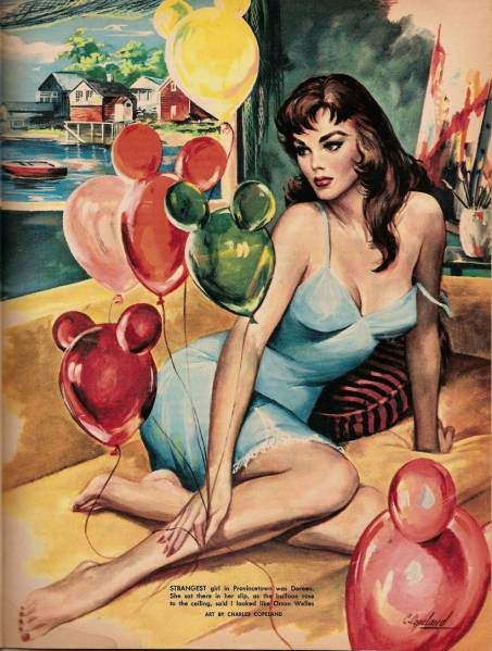 "Art, Booze and Balloon Girls" from SWANK February 1959 Charles Wesley Copeland was born on September 19, 1924 in Winona, Missouri. He was the youngest of 10 children born to John and Anna Copeland. Housing such a huge family with many grandchildren and cousins and in-laws, the Copeland family home became so well-known in Winona that when it was razed many years later, there was a photo and article in the local newspaper, "Winona Landmark to be Torn Down." At age 90, Evelyn (Copeland) Roberts still lives in Winona, and was kind enough to tell me about her brother and put me in touch with her children and nephews, who carry on the family archive of "Uncle Charles", and who provided much of the art and background information for this checklist. Charles Copeland in the 1950s - the young artist in Natchez, Mississippi (photo courtesy of Kathy Tillotson) After attending Winona High School, Charles served in the Army during World War II. Ever since childhood, Charles had been fascinated with drawing, sketching and painting. So after the war, he spent four years at the Kansas City Art Institute in Kansas City, Missouri, where he received his degree. After a sojourn in Europe, with most of his time spent in Spain, he returned to the United States and went to work as a portrait artist in Louisiana towns like Monroe and New Orleans.
Like generations of people from the middle of the country before and after him, Charles Copeland moved to New York City in 1954 in search of a life's work. He painted there for 25 years, steadily employed as a commercial artist, creating paperback book covers and magazine illustrations. Each artist has strengths and passions, and Copeland became known for his ability to create beautiful men and women. We first see his name on Lion Books in 1955, and that job led to his magazine work. Lion Books was owned by Martin Goodman, who ran a vast publishing empire from his office on Madison Avenue. Goodman was the owner of Marvel Comics, where he wisely promoted a young writer named Stan Lee. Goodman also published all kinds of magazines. Some of Copeland's earliest work for Goodman is found in two men's magazines - SWANK and BACHELOR. Whatever was needed - full-color illustrations, sketches, cartoons or small drawings - Copeland supplied it. You will find here a checklist of all of Martin Goodman's SWANK and BACHELOR numbers, with special emphasis on the contributions of Charles Copeland.
Cartoon for BACHELOR, May 1957 We notice that SWANK (published by Male Publishing) and BACHELOR (published by Official Magazine Corp) and MALE (published by Male Publishing) and TRUE ACTION (published by Official Magazine Corp) and Lion Books and all sorts of other magazines are all published at the same address - 655 Madison Avenue in NYC, later given as 625 Madison Avenue. They are all coming out of the same Factory. Copeland's editor at SWANK and BACHELOR was Bruce J. Friedman, who went on to MALE & MEN & MAN'S WORLD & TRUE ACTION after SWANK and BACHELOR were sold. Friedman then assembled a top-notch crew including assistant editor Mario Puzo, a decade before his worldwide success with THE GODFATHER. One of Goodman's specialties was a group of magazines aimed at World War II veterans, working-class blue collar average joes who loved reading the amazing adventures of their fellow G.I.s. These magazines have been called many names, including "sweats" and "armpit magazines", but today the general consensus is to remember them as "men's adventure magazines". One remarkable aspect of the men's adventure magazines is they have a definite beginning (postwar, really kicking in around 1950) and end (the late 1970s). They were of a certain time, designed for a generation who had gone off to battle in Europe or the Pacific in the 1940s. The formula did not translate as well to later wars, and as their readers grew older, the genre began to die out. There had long been adventure magazines like ARGOSY, but as the pulps died out around 1950, something new came to take their place. The first of the great long-lasting magazines was TRUE, published by Fawcett. They had been around since the late 1930s, but after World War II TRUE really came on as a non-fiction adventure magazine for men. Goodman envied TRUE's success but made the genre his own with magazines such as STAG and MALE. Editor Bruce Jay Friedman, who went on to write books, movies like SPLASH, plays and many funny short pieces, talks about his years working for Goodman's Magazine Management in the title essay of his book EVEN THE RHINOS WERE NYMPHOS. He explains the hierarchy of the men's adventure magazines: "High above all the others...stood the mighty TRUE...several notches below, but sturdy nonetheless, was a slick-looking Western cuspidor of a magazine called ARGOSY. There followed.SAGA, and then, after a bit of a leap and a bound, one reached the nether world of the Goodman books - MALE, STAG, FOR MEN ONLY, MAN'S WORLD, ACTION FOR MEN, TRUE ACTION, and so on. By no means did Magazine Management represent the end of the line. There were legions of other titles that generally featured Gestapo women prancing around captive Yanks in leg shackles. When the men's field met local opposition, the broom used was generally a large one and we were miffed at being swept off the newsstands along with the leg shacklers."
FOR MEN ONLY January 1964 "Cover by Charles Copeland" The stories told in these magazines were advertised as true, and at first they were. But with eight or so adventure titles to fill, with a hundred pages in each, after a while they started making stuff up. Friedman described it: "There were, however, just so many Borneo death trekkers to be gotten hold of. ...I had to purchase some fifty stories each month... At this point there arose the notion of simply making up "true" stories and providing them with full documentation..top left: the wallet dropped by Howard "Copter" Gibbons as he was searched by Customs...top right: Aita, the jungle girl who assisted Gibbons on the first leg of his 1000-mile Borneo "Trek to Glory" . There was, of course, no Howard "Copter" Gibbons. His photograph was that of a Hungarian gymnast. Secretaries around the office pitched in and helped us along with photographs of their boyfriends... we began to make up entirely new bombing raids, indeed, to create new World War II battles, ones that had turned the tide against the Axis and brought Hitler to his knees. The master was Mario Puzo, who could create giant mythical armies, lock them in combat in Central Europe, and have casualties coming in by the hundreds of thousands." Puzo once said that anybody could make up a battle, he was proud of having invented entire wars. It is difficult to imagine even their most gullible readers being taken in by some of the stories. The writers and editors were always forced to use such qualifying statements as "the zaniest, wackiest incident of the War" or "secret mission just made public". Each average MALE or STAG adventure had a hero, a lone but tough working-class blue collar average G.I., trapped behind enemy lines but somehow able to win a decisive mission with only the help of a loyal band of local prostitutes. TRUE ACTION readers must have believed prostitutes secretly won the War. You probably weren't aware of this, but it turns out that Italy's submarine fleet was wiped out by an undersea brothel sub full of French hookers (MALE October 1960). In "The Yank Sgt. Who Ran DeGaulle's Secret Army of Women" in the March 1962 issue of STAG, not only do the French have a secret army of women, but they are letting one single American soldier commandeer it. And he's not some elite Major from the O.S.S., he is an Infantry Sergeant. In this "true" story an army of prostitute double agents and machine gun toting peasant girls have personally infuriated Hitler with their daring deeds. In addition to the combat stories, there were adventure sagas of every stripe, and articles geared to their readers like "You're Paying Through the Nose for On-the-Cuff Tax Dodgers" and "I Joined a Go-Naked Swap Cult". Where else will you find "77 Kamikaze Harem Virgins" or "'Easy' Girls - How to Spot Their Sex Signals" (wait a minute, I think I should read this.). My favorite men's adventure magazine title is "Flying Saucer Crime Wave", which explained the government cover-up of a nefarious bunch of aliens in UFOs. Another favorite is "Abe Lincoln, Backwoods Brawler" with Bob Stanley's art of a shirtless, buff and heavily muscled Lincoln tossing a large man over his shoulder. It's a shock to see lanky Lincoln's familiar face on a bodybuilder's frame. The titles of the stories often defy logic. For unknown reasons they have at least one hyphen in almost every title, sometimes two, three or more. They even managed to work a hyphen into the title "Just Call Me Candy - Baby". With several illustrations needed for each issue, and new issues each month, the demand was high. And those of us who love the lost art of magazine illustration are still reaping the benefits of that era. Martin Goodman and his editors demanded excellence, and as a result we have a lot to enjoy. This checklist highlights the contributions of just one particular artist, but please understand I am in no way suggesting he is the only point of interest in the magazines listed. I wish I could have done a complete checklist like I did with the much-shorter lived Goodman version of SWANK. But there are just too many to describe in detail. Almost every issue features great fiction, from Ian Fleming's James Bond to authors like Lawrence Block and Richard Stark. When former associate editor Mario Puzo sold his novel THE GODFATHER for magazine abridgement, he could have gone to one of the top-paying slicks like ESQUIRE or PLAYBOY. But out of loyalty, he sold it to MALE magazine. It made for a great issue with a cover by Mort Kunstler and interior illustrations by the legendary Earl Norem. Puzo had earlier expanded one of his adventure stories into the Banner paperback SIX GRAVES TO MUNICH, published under his pseudonym Mario Cleri. For a long time there was very little information available about men's adventure magazines, unless you were lucky enough to get a copy of the privately printed DEVINE'S GUIDE TO MEN'S ADVENTURE MAGAZINES. That changed in 2003 and 2004 with the appearances of two books on the subject, Adam Parfrey's IT'S A MAN'S WORLD from Feral House (which included Friedman's essay "Even the Rhinos Were Nymphos" and some of Devine's GUIDE) and Taschen's MEN'S ADVENTURE MAGAZINES: THE RICH OBERG COLLECTION by Max Allan Collins & George Hagenauer. Both books have many color reproductions from the days of the sweats, and offer an outline of their history. Both of them showed a couple Copeland illustrations, although the Taschen book unfortunately incorrectly credits George Gross's cover for BATTLEFIELD #1 to Copeland. Gross's signature is obscured but still visible on the cover. Another source that is to be commended for a rare reference to Charles Copeland is Alberto Becattini's AMERICAN GOOD GIRL ART: 1950s-1990s, in GLAMOUR INTERNATIONAL #19, 1992. Becattini wisely places Copeland in the proper context, on a list of the great pin-up, comic book and magazine artists of the second half of the 20th century. I agree that Copeland earned a place on such a list, and it's a shame that all other books about those artists failed to mention his work. The late great lamented era of American magazine illustration had a full flowering in the "Goodman books" of the 1950s through the 1970s. Friedman wrote: "our readers seemed to prefer illustrations in which each hair follicle shone through with brilliance. Attempts at nonrepresentational, Chagall-like drawings brought out the worst in Martin Goodman. Illustrations were generally gotten up before the true adventures were created. No writer has ever been left quite so shaken as Mario Puzo, his first week on the job, when the author-to-be of THE GODFATHER was shown a finished illustration for a thirty-thousand word jungle trek yarn he had not yet begun to write". That "nonrepresentational", scribbled, sketchy art was prevalent in many other men's magazines of the day, but to his credit Goodman knew what we wanted. His art editors hired an amazing roster of artists to create the realistic, brilliant covers and interior illustrations that even today make the Goodman magazines collectible. Among his artists were such names as Mort Kunstler (who was very often called upon to supply the covers that set the tone for all that was to follow), James Bama, Samson Pollen, Al Rossi, Earl Norem, Bob Stanley, Rudy Nappi, Bruce Minney, Gil Cohen, Julian Paul, Walter Popp, Rafael DeSoto, Ray Johnson, Vic Prezio, John Leone, Tom Ryan, Robert Schulz, George Gross, Norm Saunders, Paul Rader - and Charles Copeland. Copeland first appears in MEN in April 1956, and continued on doing illustrations for the Goodman group for another 18 years. He also did many covers for them (our Copeland magazine checklist has over 500 works of art listed on it). With his talent, speed, versatility and adaptability, Copeland was adept at working with gouache on board, and he was an ideal artist for this job. He could paint just about anything, but the editors tended to call on him just for certain types of art. "Yanks shooting at Nazis" was a men's adventure magazine staple that Copland could draw as well as the next guy, but not too many artists could paint a beautiful woman like Charles Copeland. He could work equally brilliantly in whatever medium he was assigned - duotone, four-color, black & white or color. Some of the artists listed above contributed to these magazines more in the 1950s and then went on to other work. After a while, in the mid-1960s to 1970s, a core group of six artists seemed to do most of the illustration for Magazine Management: Kunstler, Cohen, Copeland, Minney, Norem and Pollen. Copeland died young; the other five men are as of this writing still living. All five of them have gone on to do some awesome work over the past 30 years, and each one of them deserves a checklist like this one. Mort Kunstler has been the deserving subject of books and a whole issue of ILLUSTRATION Magazine, but each of these other artists is overdue for such attention as well. Samson Pollen created a number of memorable illustrations and paintings, for these magazines and others. Earl Norem went on to create a series of now-famous comic book covers. Gil Cohen did many of THE EXECUTIONER paperbacks and many others. Bruce Minney has given us fine paperback book covers, many different magazine illustrations, and work for NBC. I have chosen Charles Copeland here because he died young and should not be forgotten, but I hope to see others give us overviews on each of these gifted artists. In addition to their hundreds of magazine illustrations, most of these artists all did paperback covers too. Here are nine of my favorites.
There are hundreds of other illustrations and cartoons in these magazines to enjoy also. I wish I could show you all of Copeland's illustrations. I lost count when it passed 500. The images shown on our checklist are from my collection and from the Copeland family, with much-welcome assistance from the good folks at American Art Archives and Magazine Data File, two websites I highly recommend. When I started this research there was almost nothing online about Copeland, but today you can see a wonderful file of his magazine work, and the work of many other illustrators, at American Art Archives. With so many slots open for illustration, these magazines would naturally often have two or more paintings by the same artist in one issue. They handled this in various ways. Sometimes both illustrations would have the same name on them, but more often the second painting would simply be uncredited. At other times, they used the standard industry practice of assigning a pseudonym to the second piece. Mort Kunstler used his initials to become Emmett Kaye. Gil Cohen was often Brian David. Ray Johnson was also Ben Thomas. Bruce Minney was both himself and Ben Sachs in the February 1973 issue of STAG. And so on. Charles Copeland usually just used his own name, but there were two exceptions, and both have been found only once each. In the 1969 STAG ANNUAL there are three Copeland illustrations. The first one is credited to him and the second is uncredited. But the third one says "Art by Barry Charles". The same painting appeared in the November 1965 issue of MALE, where Copeland's signature was visible and the accompanying text read "art by Charles Copeland". On the STAG reprint, Copeland's signature is visibly painted over. In the April 1966 issue of STAG, the first of two Copeland illustrations is credited to him, but the second says "art by C. Wesley". On this art Copeland has signed the name "Wesley" (his middle name). Both of these illustrations are shown on our magazine checklist. Copeland at work - photo courtesy of Jackie Copeland Zwolak This photograph shows Charles Copeland painting the illustration used in KEN FOR MEN, November 1959. At this stage in the composition the background has not yet been filled in, and the native girl on the left is topless. Long hair would cover her in this finished version shown below. I'm no art expert but I think his careful use of the color red in this duotone illustration is quietly visually arresting.
Disclaimer: Speaking of native girls, it's important to remember that these magazines and the images in them are objects of their times. The "us vs. them" attitudes toward "others" of any type - people of any color, people from faraway lands - is reprehensible and mercifully not tolerated today. The treatment of indigenous peoples and Asians - especially the Japanese - may have been the norm in its day, but not today. We present these images for their historical and artistic value, but we can not tolerate the racism inherent in many of the stories and derogatory words. In one sample month - June 1965 - Copeland art appears in ACTION FOR MEN, COMPLETE MAN, FOR MEN ONLY, MALE, MAN'S WORLD, MEN, STAG and TRUE ACTION. That's eight different paintings in a one-month period. At the same time Copeland was painting all these illustrations for the men's adventure magazines, he was also creating a series of paperback book covers for publishers like Berkley and Paperback Library, shown here on our Copeland Paperback Checklist. Copeland's cover art was used in the ad campaign for Paperback Library 52-297, THREE TO MAKE MERRY by Dee Hill: Gradually, inevitably, the era of the men's adventure mags drew to a halt. In the 1970s "topless" illustration was seen for the first time, and more and more issues included a "special fiction" story by a staff writer like Dick Love or Alex Austin. These stories are fantasy romances geared to men, and usually Copeland or Samson Pollen would be enlisted to provide the splashy two-page color art for the title page. See for example "Two Nudes in Motel Room No. 8" by Dick Love in the October 1970 issue of STAG. The hero of the story, who finds himself in the unlikely titular situation, is modeled after the target reader. He is an assistant shop foreman at an auto body shop in San Bernardino. All of the men's adventure magazines either closed up shop or evolved into nudie magazines with photos for illustrations. As surely as they came to light in the early 1950s, they died out as the 1970s ended. After the Goodman magazines stopped buying art, Copeland spent the next five years doing paperback covers. He did a lot of Gothic romances for Ace and Berkley and Popular Library. He did a lot of covers for 1970s paperback houses like Leisure and Belmont Tower and Pinnacle. Charles Copeland in the 1970s While preparing this checklist I interviewed several people who had worked with Copeland. Art editor Larry Graber told me "I worked with Charles Copeland for many years and always found him to be a perfect gentleman." When I talked to Bruce Minney I asked him what was the first thing that popped into his head when I said the name "Charles Copeland". His answer was "Drinking cocktails with Charlie at 10 o'clock in the morning. That was a first for me. I went to visit him at his place in Manhattan and he served up some martinis and told me all about the sex escapades of JFK. I was shocked and didn't want to believe our beloved president was a 'cocksman', to use Copeland's term." It was shocking then, although today of course we've all heard the stories about Kennedy's endless parade of movie stars, beauty models and cocktail waitresses. (In a recent book about the secret service agents assigned to protect the President, IN THE PRESIDENT'S SECRET SERVICE, JFK is quoted telling a diplomat "a night without strange is a night wasted.") But how could Charles Copeland have this insider knowledge back in the 1960s? The most likely solution is he had befriended an actor named Dean Severence, who in turn knew Peter Lawford, the President's brother-in-law, who knew the whole story. In Peter Lawford's mother's autobiography she mentions "Peter's friend, the actor Dean Severance" (a common misspelling of Dean's last name). Charles and Dean remained buddies for many years. When I asked Samson Pollen about Copeland, he told me that Charles had fallen victim to one of the dangers of living in a busy city like New York - he had been hit by a car while crossing the street. "The doctors botched the operation on his leg, and as a result his recovery took much longer than it might have. He was in pain, and he seemed weakened by the whole affair, never fully recovered." Copeland's family confirmed that story for me, noting that Charles suffered this accident in 1967. This answered one of the questions from my Copeland checklist - why there are no Copeland magazine illustrations during the summer of 1967. He took some time off to recuperate. When I asked Ed Balcourt what word best described Copeland, he thought for a moment and said "fragile." Another description I heard of him was "frail". Bruce Minney said "I also remember Charles' hands shook, I wondered how he could paint a beautiful woman with his hands shaking - but he did OK." Almost every photograph I've seen of Charles Copeland shows him with a lit cigarette in his hand. Inevitably all that smoking and drinking caught up with him. Charles Copeland knew he was sick but insisted on completing his last commission before checking into the hospital. He had cancer of the esophagus. The cancer ate right through him and he died on November 7, 1979, in the Manhattan Eye Ear Nose and Throat Hospital. He was cremated and his ashes were laid to rest at Mt Zion Cemetery back home in Winona. His sister Evelyn wrote his obituary, noting "At the age of 13 he accepted Christ as his savior and before his death he reaffirmed his faith." Evelyn knew that Charles had always, always had his interests centered around Art and things of beauty, and so she closed his obituary with a fitting line from Keats: "A thing of beauty is a joy forever; it's loveliness increases, it can never pass into nothingness." Charles Copeland had a unique sense of style that is unmistakably and completely his own. One of his trademarks is an impossibly beautiful woman. His favorite pose for her was looking back sideways out of the corners of her eyes at someone coming up beside her or behind her. He would return to this theme time and time again, not always, but so often that "the sideways glance" informs many of his best covers and interior illustrations. With their 1950s & 1960s hairstyles and clothing, they are very much iconic images of their times.
There are more than 125 paperback covers on my Copeland checklist. At his best, he possessed the ability to capture a moment from a story onto his art board and create a thing of beauty. He used color like a master and gave us art that will continue on as long as book covers and magazine illustrations are shared. Mr. Copeland may have died thirty years ago, but these beauties live on, a joy forever. We have not yet discovered the book or magazine appearances of the following paintings from the Copeland family archives. If you have or recognize any of them please contact me. This is the first draft of a work in progress. There surely are other Copeland covers waiting to be re-discovered. Let me know if you find any. |


Home | Charles Copeland | Paperbacks | Mistakes | Movie Posters | Magazines |
Lynn Munroe Books